Reference version

This documentation is available as Markdown for AI agents and LLMs. See the full Markdown index or append .md to any documentation URL.

BottomSheet

A SwiftUI BottomSheet component that presents content from the bottom of the screen.

iOS
tvOS
Included in Expo Go
Recommended version:
~57.0.8

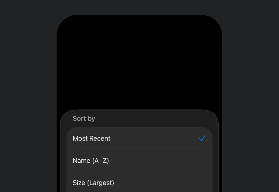
Expo UI BottomSheet matches the official SwiftUI sheet API and presents content from the bottom of the screen.

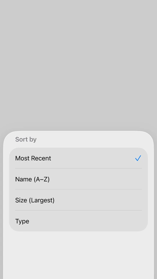
A BottomSheet at medium detent showing a Sort By list with Most Recent selected

Installation

Terminal
npx expo install @expo/ui

If you are installing this in an existing React Native app, make sure to install expo in your project.

Usage

Basic bottom sheet

Pass the control that opens the sheet as the anchor prop. The children are the sheet's content.

BasicBottomSheetExample.tsx
import { useState } from 'react'; import { Host, BottomSheet, Button, Text, VStack } from '@expo/ui/swift-ui'; export default function BasicBottomSheetExample() { const [isPresented, setIsPresented] = useState(false); return ( <Host style={{ flex: 1 }}> <VStack> <BottomSheet isPresented={isPresented} onIsPresentedChange={setIsPresented} anchor={<Button label="Open sheet" onPress={() => setIsPresented(true)} />}> <Text>Hello, world!</Text> </BottomSheet> </VStack> </Host> ); }

React Native view as an anchor

The anchor can be a React Native view. Wrap it in RNHostView.

BottomSheetRNAnchorExample.tsx
import { useState } from 'react'; import { Pressable, Text as RNText } from 'react-native'; import { Host, BottomSheet, Button, RNHostView, Text, VStack } from '@expo/ui/swift-ui'; export default function BottomSheetRNAnchorExample() { const [isPresented, setIsPresented] = useState(false); return ( <Host style={{ flex: 1 }}> <VStack> <BottomSheet isPresented={isPresented} onIsPresentedChange={setIsPresented} fitToContents anchor={ <RNHostView matchContents> <Pressable onPress={() => setIsPresented(true)} style={{ backgroundColor: '#007AFF', padding: 12, borderRadius: 8, alignSelf: 'flex-start', }}> <RNText style={{ color: 'white', fontWeight: '600' }}>Open sheet</RNText> </Pressable> </RNHostView> }> <VStack> <Text>Opened from a React Native anchor.</Text> <Button label="Close" onPress={() => setIsPresented(false)} /> </VStack> </BottomSheet> </VStack> </Host> ); }

Bottom sheet that fits content

Use the fitToContents prop to automatically size the sheet to fit its content.

BottomSheetFitsContentExample.tsx
import { useState } from 'react'; import { Host, BottomSheet, Button, Text, VStack } from '@expo/ui/swift-ui'; export default function BottomSheetFitsContentExample() { const [isPresented, setIsPresented] = useState(false); return ( <Host style={{ flex: 1 }}> <VStack> <BottomSheet isPresented={isPresented} onIsPresentedChange={setIsPresented} fitToContents anchor={<Button label="Open sheet" onPress={() => setIsPresented(true)} />}> <VStack> <Text>This sheet automatically sizes to fit its content.</Text> <Button label="Close" onPress={() => setIsPresented(false)} /> </VStack> </BottomSheet> </VStack> </Host> ); }

Custom background color

By default, a sheet uses the system's translucent material background (Liquid Glass on iOS 26). Use the presentationBackground modifier on Group to paint the sheet with a solid color instead, which also opts the sheet out of that translucent material.

BottomSheetBackgroundColorExample.tsx
import { useState } from 'react'; import { Host, BottomSheet, Button, Group, Text, VStack } from '@expo/ui/swift-ui'; import { presentationBackground, presentationDetents, padding, foregroundStyle, } from '@expo/ui/swift-ui/modifiers'; export default function BottomSheetBackgroundColorExample() { const [isPresented, setIsPresented] = useState(false); return ( <Host style={{ flex: 1 }}> <VStack> <BottomSheet isPresented={isPresented} onIsPresentedChange={setIsPresented} anchor={<Button label="Open sheet" onPress={() => setIsPresented(true)} />}> <Group modifiers={[ presentationDetents(['medium', 'large']), presentationBackground('#ffffff'), ]}> <VStack modifiers={[padding({ all: 20 })]}> <Text modifiers={[foregroundStyle('#000000')]}>Solid white sheet background.</Text> <Button label="Close" onPress={() => setIsPresented(false)} /> </VStack> </Group> </BottomSheet> </VStack> </Host> ); }

Bottom sheet with presentation detents

Use the presentationDetents modifier on Group to control the available heights. You can use:

  • 'medium': System medium height (approximately half screen)
  • 'large': System large height (full screen)
  • { fraction: number }: Fraction of screen height (0-1)
  • { height: number }: Fixed height in points
BottomSheetWithDetentsExample.tsx
import { useState } from 'react'; import { Host, BottomSheet, Button, Group, Text, VStack } from '@expo/ui/swift-ui'; import { presentationDetents } from '@expo/ui/swift-ui/modifiers'; export default function BottomSheetWithDetentsExample() { const [isPresented, setIsPresented] = useState(false); return ( <Host style={{ flex: 1 }}> <VStack> <BottomSheet isPresented={isPresented} onIsPresentedChange={setIsPresented} anchor={<Button label="Open sheet" onPress={() => setIsPresented(true)} />}> <Group modifiers={[ presentationDetents(['medium', 'large', { fraction: 0.3 }, { height: 200 }]), ]}> <Text>This sheet can snap to multiple heights.</Text> </Group> </BottomSheet> </VStack> </Host> ); }

Bottom sheet with detent selection tracking

Pass selection and onSelectionChange options to presentationDetents to programmatically control which detent the sheet snaps to.

BottomSheetWithDetentSelectionExample.tsx
import { useState } from 'react'; import { Host, BottomSheet, Button, List, Section, Text, VStack, Group } from '@expo/ui/swift-ui'; import { presentationDetents, presentationDragIndicator, foregroundStyle, } from '@expo/ui/swift-ui/modifiers'; import type { PresentationDetent } from '@expo/ui/swift-ui/modifiers'; export default function BottomSheetWithDetentSelectionExample() { const [isPresented, setIsPresented] = useState(false); const detents: PresentationDetent[] = [{ height: 300 }, { fraction: 0.3 }, 'medium', 'large']; const [selectedDetent, setSelectedDetent] = useState<PresentationDetent>('medium'); const formatDetent = (detent: PresentationDetent): string => { if (typeof detent === 'string') return detent; if ('fraction' in detent) return `Fraction ${detent.fraction}`; return `Height ${detent.height}`; }; return ( <Host style={{ flex: 1 }}> <VStack> <BottomSheet isPresented={isPresented} onIsPresentedChange={setIsPresented} anchor={<Button label="Show sheet" onPress={() => setIsPresented(true)} />}> <Group modifiers={[ presentationDetents(detents, { selection: selectedDetent, onSelectionChange: setSelectedDetent, }), presentationDragIndicator('visible'), ]}> <List> <Section title="Change detent"> <Button label="Height 300" onPress={() => setSelectedDetent({ height: 300 })} /> <Button label="Fraction 0.3" onPress={() => setSelectedDetent({ fraction: 0.3 })} /> <Button label="Medium" onPress={() => setSelectedDetent('medium')} /> <Button label="Large" onPress={() => setSelectedDetent('large')} /> </Section> <Section title="Current"> <Text modifiers={[foregroundStyle('secondaryLabel')]}> {formatDetent(selectedDetent)} </Text> </Section> </List> </Group> </BottomSheet> </VStack> </Host> ); }

Bottom sheet with background interaction

Use the presentationBackgroundInteraction modifier to allow interactions with content behind the sheet.

BottomSheetWithBackgroundInteractionExample.tsx
import { useState } from 'react'; import { Host, BottomSheet, Button, Group, Text, VStack } from '@expo/ui/swift-ui'; import { presentationDetents, presentationBackgroundInteraction, } from '@expo/ui/swift-ui/modifiers'; export default function BottomSheetWithBackgroundInteractionExample() { const [isPresented, setIsPresented] = useState(false); return ( <Host style={{ flex: 1 }}> <VStack> <BottomSheet isPresented={isPresented} onIsPresentedChange={setIsPresented} anchor={<Button label="Open sheet" onPress={() => setIsPresented(true)} />}> <Group modifiers={[ presentationDetents(['medium', 'large']), presentationBackgroundInteraction({ type: 'enabledUpThrough', detent: 'medium' }), ]}> <Text>Interact with content behind when at medium height.</Text> </Group> </BottomSheet> </VStack> </Host> ); }

Non-dismissible bottom sheet

Use the interactiveDismissDisabled modifier to prevent users from dismissing the sheet by swiping.

NonDismissibleBottomSheetExample.tsx
import { useState } from 'react'; import { Host, BottomSheet, Button, Group, Text, VStack } from '@expo/ui/swift-ui'; import { interactiveDismissDisabled } from '@expo/ui/swift-ui/modifiers'; export default function NonDismissibleBottomSheetExample() { const [isPresented, setIsPresented] = useState(false); return ( <Host style={{ flex: 1 }}> <VStack> <BottomSheet isPresented={isPresented} onIsPresentedChange={setIsPresented} anchor={<Button label="Open sheet" onPress={() => setIsPresented(true)} />}> <Group modifiers={[interactiveDismissDisabled()]}> <VStack> <Text>This sheet cannot be dismissed by swiping.</Text> <Button label="Close" onPress={() => setIsPresented(false)} /> </VStack> </Group> </BottomSheet> </VStack> </Host> ); }

Bottom sheet with React Native content

Use RNHostView to embed React Native components inside the bottom sheet. Set matchContents to automatically size the host view to fit its content.

BottomSheetWithRNContentExample.tsx
import { useState } from 'react'; import { Pressable, Text as RNText, View } from 'react-native'; import { Host, BottomSheet, Button, Group, RNHostView, VStack } from '@expo/ui/swift-ui'; import { presentationDragIndicator } from '@expo/ui/swift-ui/modifiers'; export default function BottomSheetWithRNContentExample() { const [isPresented, setIsPresented] = useState(false); const [counter, setCounter] = useState(0); return ( <Host style={{ flex: 1 }}> <VStack> <BottomSheet isPresented={isPresented} onIsPresentedChange={setIsPresented} fitToContents anchor={<Button label="Open sheet" onPress={() => setIsPresented(true)} />}> <Group modifiers={[presentationDragIndicator('visible')]}> <RNHostView matchContents> <View style={{ padding: 24 }}> <RNText style={{ fontSize: 18, fontWeight: 'bold', marginBottom: 8 }}> React Native Content </RNText> <RNText style={{ color: '#666', marginBottom: 16 }}>Counter: {counter}</RNText> <Pressable style={{ backgroundColor: '#007AFF', padding: 12, borderRadius: 8, alignItems: 'center', marginBottom: 12, }} onPress={() => setCounter(counter + 1)}> <RNText style={{ color: 'white', fontWeight: '600' }}>Increment</RNText> </Pressable> <Pressable style={{ backgroundColor: '#FF3B30', padding: 12, borderRadius: 8, alignItems: 'center', }} onPress={() => setIsPresented(false)}> <RNText style={{ color: 'white', fontWeight: '600' }}>Close</RNText> </Pressable> </View> </RNHostView> </Group> </BottomSheet> </VStack> </Host> ); }

Bottom sheet with flexible React Native content

When using React Native content with flex: 1, omit the matchContents prop on RNHostView and use presentationDetents to control the sheet height.

BottomSheetWithFlexRNContentExample.tsx
import { useState } from 'react'; import { Text as RNText, View } from 'react-native'; import { Host, BottomSheet, Button, Group, RNHostView, VStack } from '@expo/ui/swift-ui'; import { presentationDetents, presentationDragIndicator } from '@expo/ui/swift-ui/modifiers'; export default function BottomSheetWithFlexRNContentExample() { const [isPresented, setIsPresented] = useState(false); return ( <Host style={{ flex: 1 }}> <VStack> <BottomSheet isPresented={isPresented} onIsPresentedChange={setIsPresented} anchor={<Button label="Open sheet" onPress={() => setIsPresented(true)} />}> <Group modifiers={[ presentationDetents(['medium', 'large']), presentationDragIndicator('visible'), ]}> <RNHostView> <View style={{ flex: 1, backgroundColor: '#007AFF', padding: 24 }}> <RNText style={{ fontSize: 18, fontWeight: 'bold', color: 'white' }}> Flexible React Native Content </RNText> <RNText style={{ color: 'white', marginTop: 8 }}> This content fills the available space in the sheet. </RNText> </View> </RNHostView> </Group> </BottomSheet> </VStack> </Host> ); }

Scrollable React Native content

Nest a scrollable React Native list such as FlatList, ScrollView, or a high-performance list like FlashList or Legend List inside the sheet with RNHostView. Size the sheet with presentationDetents and the list scrolls within that height.

BottomSheetWithScrollableContentExample.tsx
import { useState } from 'react'; import { FlatList, Text as RNText, View } from 'react-native'; import { Host, BottomSheet, Button, Group, RNHostView, VStack } from '@expo/ui/swift-ui'; import { presentationDetents, presentationDragIndicator } from '@expo/ui/swift-ui/modifiers'; const DATA = Array.from({ length: 50 }, (_, i) => `Item ${i + 1}`); export default function BottomSheetWithScrollableContentExample() { const [isPresented, setIsPresented] = useState(false); return ( <Host matchContents> <VStack> <BottomSheet isPresented={isPresented} onIsPresentedChange={setIsPresented} anchor={<Button label="Open sheet" onPress={() => setIsPresented(true)} />}> <Group modifiers={[ presentationDetents(['medium', 'large']), presentationDragIndicator('visible'), ]}> <RNHostView> <View style={{ padding: 16 }}> <FlatList data={DATA} keyExtractor={item => item} renderItem={({ item }) => <RNText style={{ paddingVertical: 16 }}>{item}</RNText>} /> </View> </RNHostView> </Group> </BottomSheet> </VStack> </Host> ); }

API

import { BottomSheet } from '@expo/ui/swift-ui';

Component

BottomSheet

Type: React.Element<BottomSheetProps>

BottomSheet presents content from the bottom of the screen.

BottomSheetProps

anchor

Optional • Type: ReactNode

A view the sheet is anchored to, for example the Button that opens it. Rendered in place and kept mounted, so presenting the sheet doesn't shift surrounding layout. Optional.
children

Type: ReactNode

The sheet's content, mounted while presented and unmounted after dismiss. Wrap it in Group to apply presentation modifiers.

fitToContents

Optional • Type: boolean • Default: false

When true, the sheet will automatically size itself to fit its content. This sets the presentation detent to match the height of the children.

isPresented

Type: boolean

Whether the BottomSheet is presented.

onDismiss

Optional • Type: () => void

Callback function that is called after the BottomSheet has been fully dismissed.

onIsPresentedChange

Type: (isPresented: boolean) => void

Callback function that is called when the BottomSheet presented state changes.