This documentation is available as Markdown for AI agents and LLMs. See the full Markdown index or append .md to any documentation URL.
Jetpack Compose
Jetpack Compose components for building native Android interfaces with @expo/ui.
The Jetpack Compose components in @expo/ui/jetpack-compose allow you to build fully native Android interfaces using Jetpack Compose from React Native.
Installation
If you are installing this in an existing React Native app, make sure to install expo in your project.
Usage
Using a component from @expo/ui/jetpack-compose requires wrapping it in a Host component. The Host is a container for Jetpack Compose views.
import { Host, Button } from '@expo/ui/jetpack-compose';

export function SaveButton() {
  return (
    <Host matchContents>
      <Button onClick={() => alert('Saved!')}>Save changes</Button>
    </Host>
  );
}
Create custom Jetpack Compose components and modifiers that integrate with Expo UI.
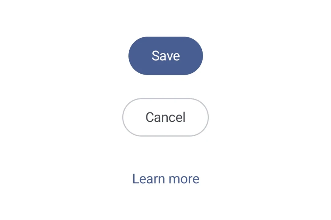
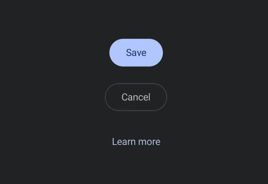
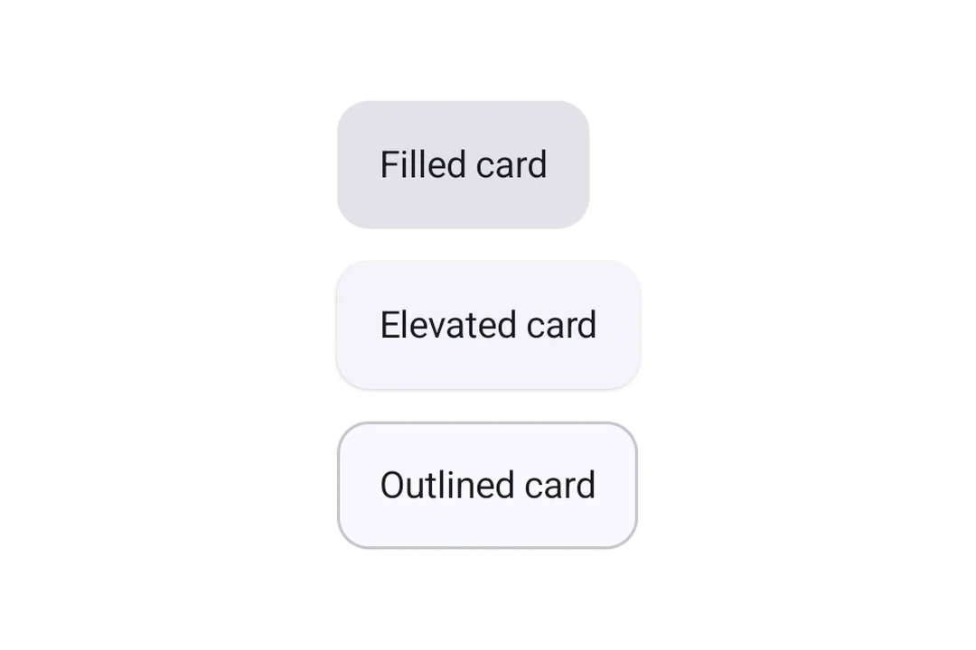
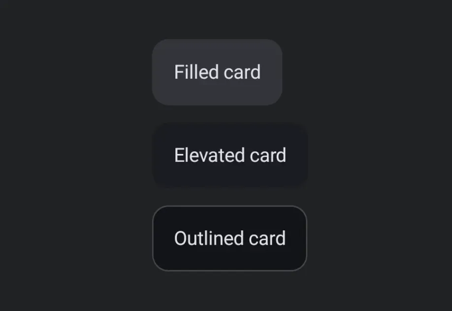
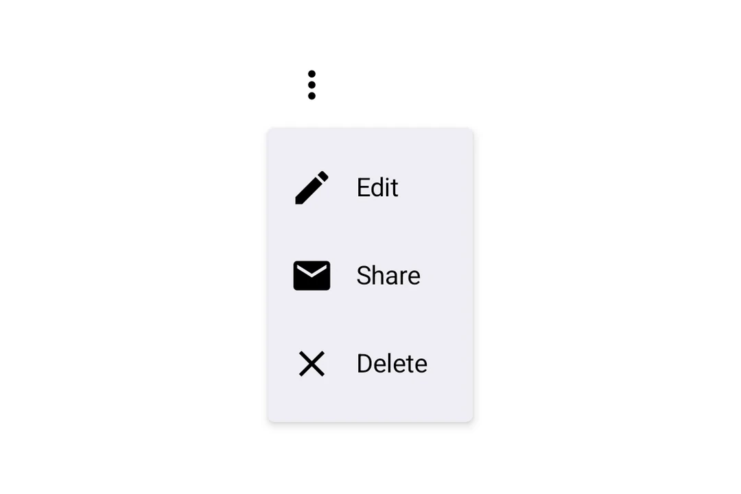
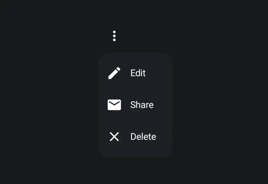
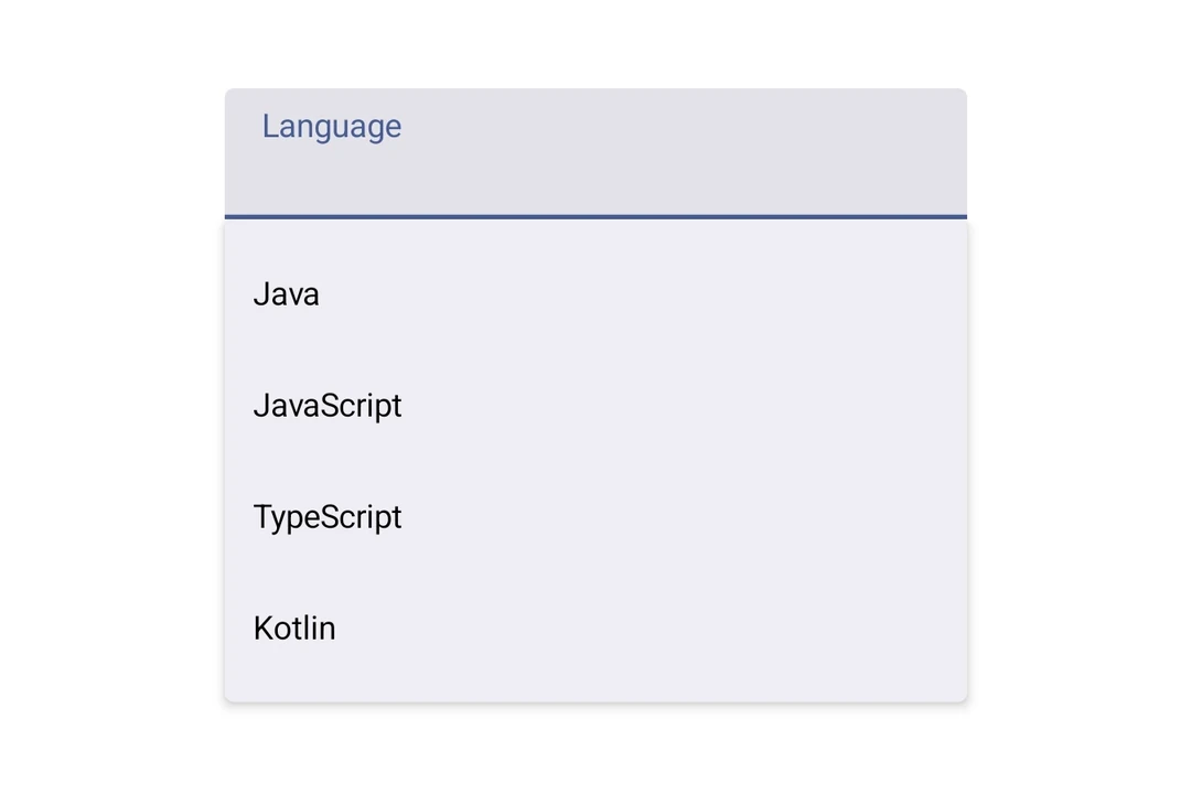
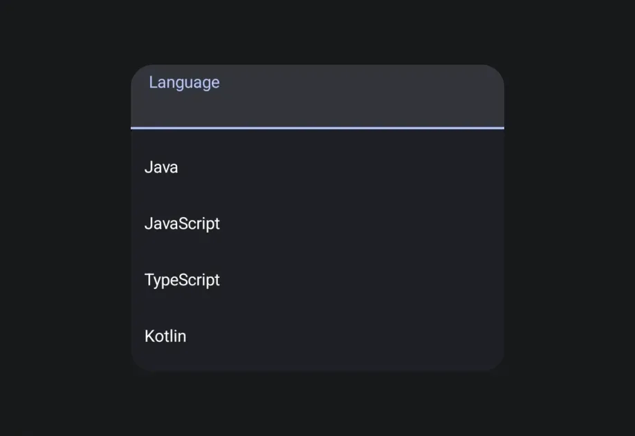
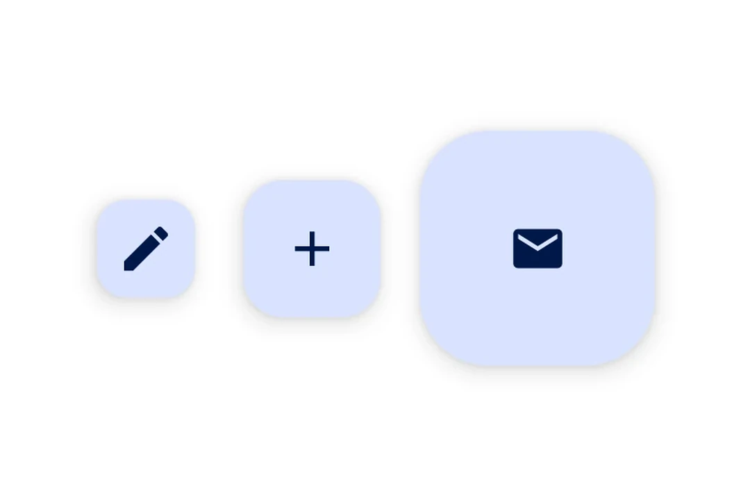
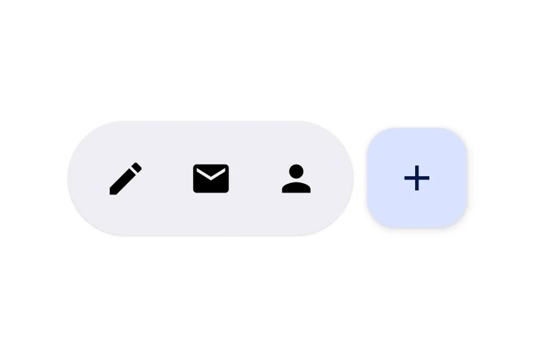
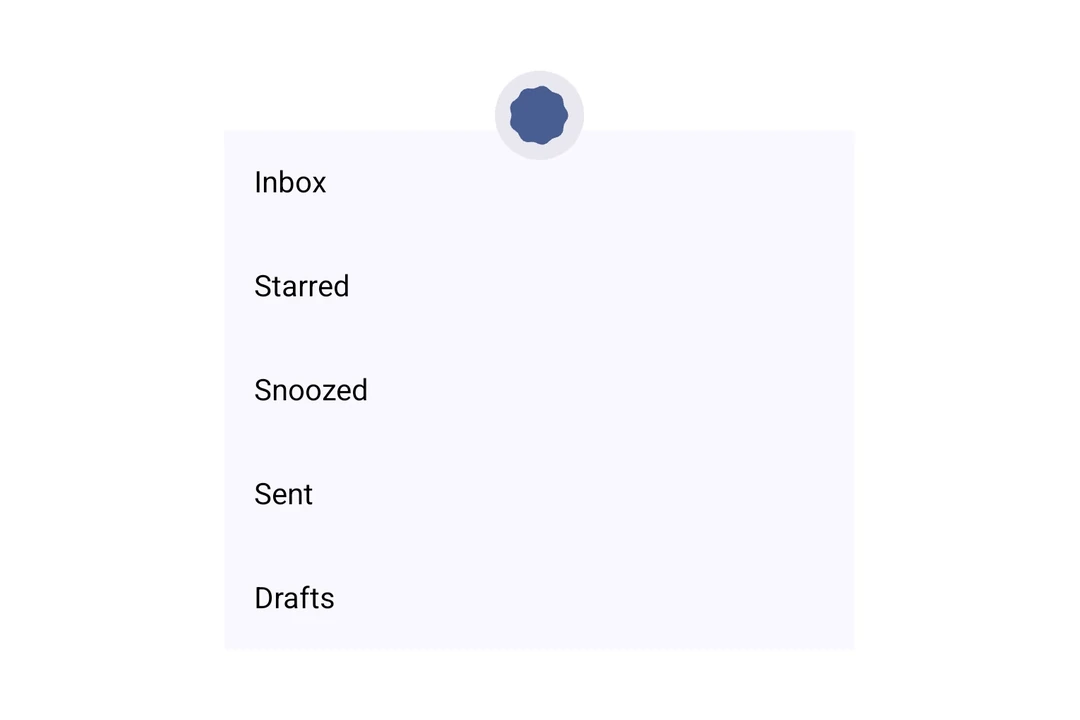
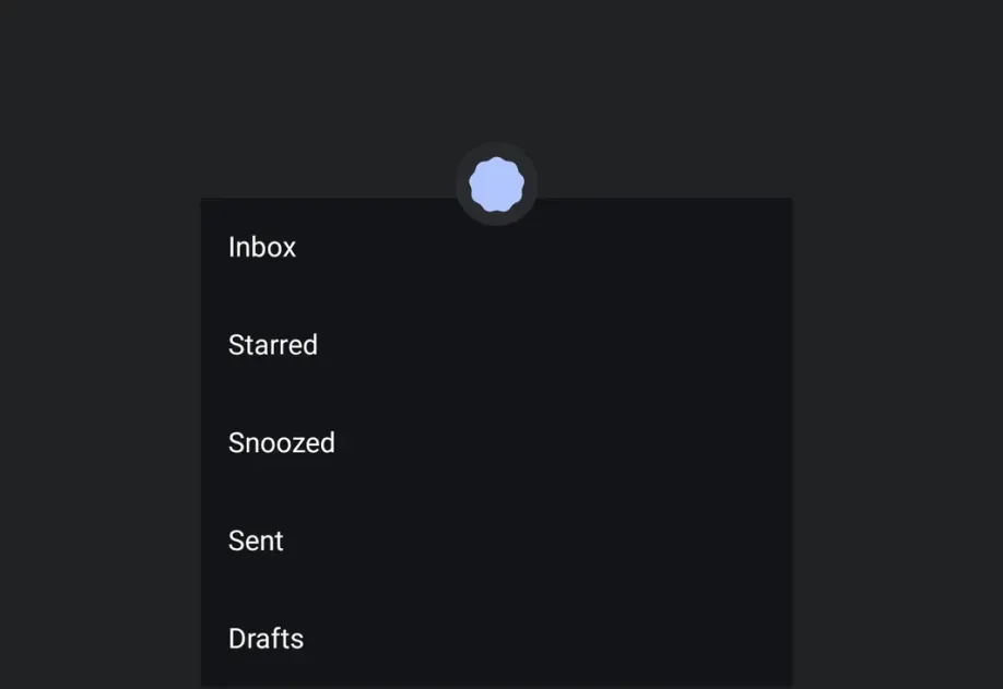
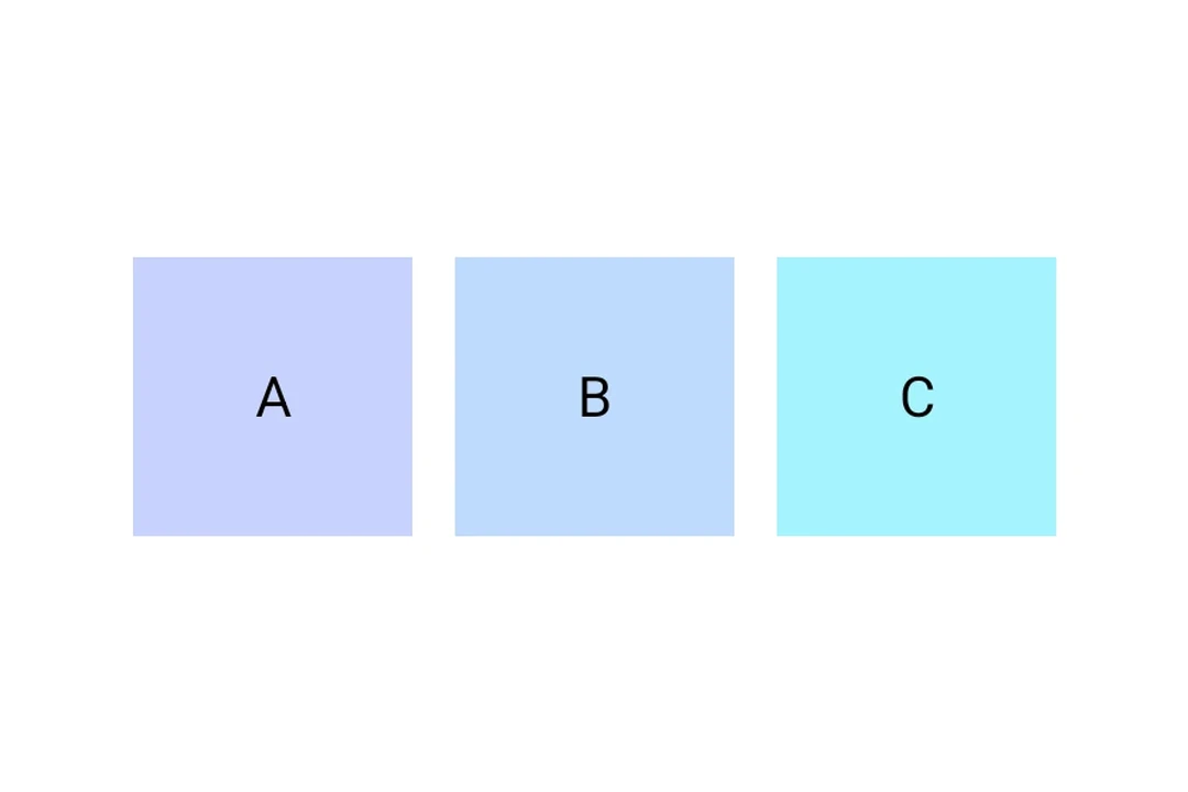
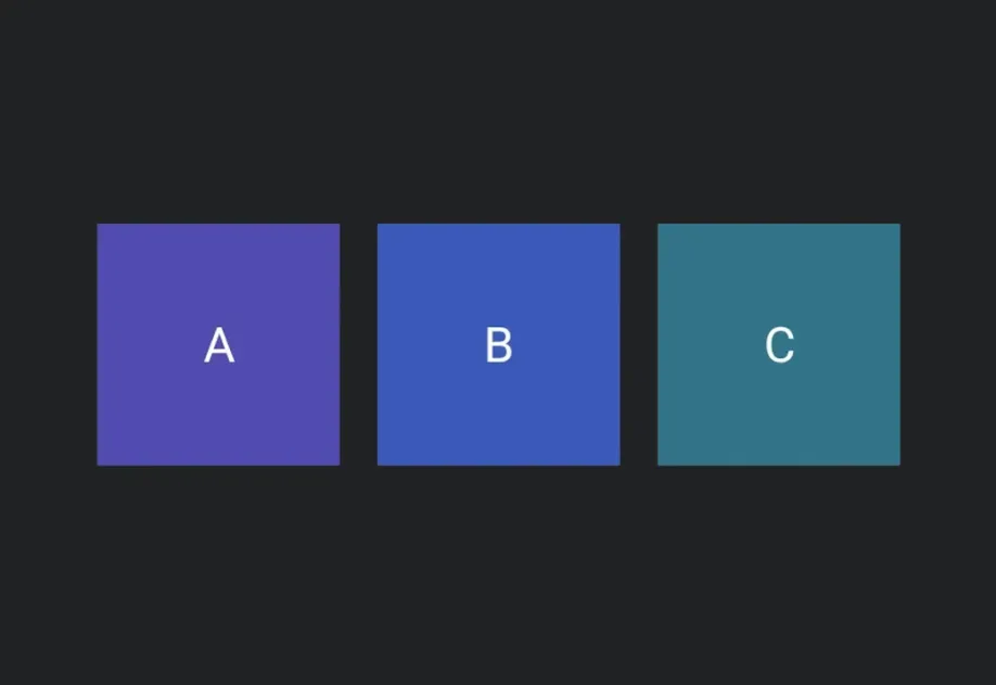
Available components
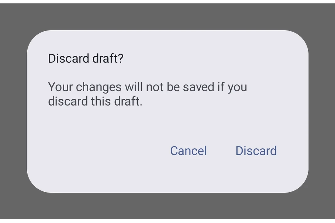
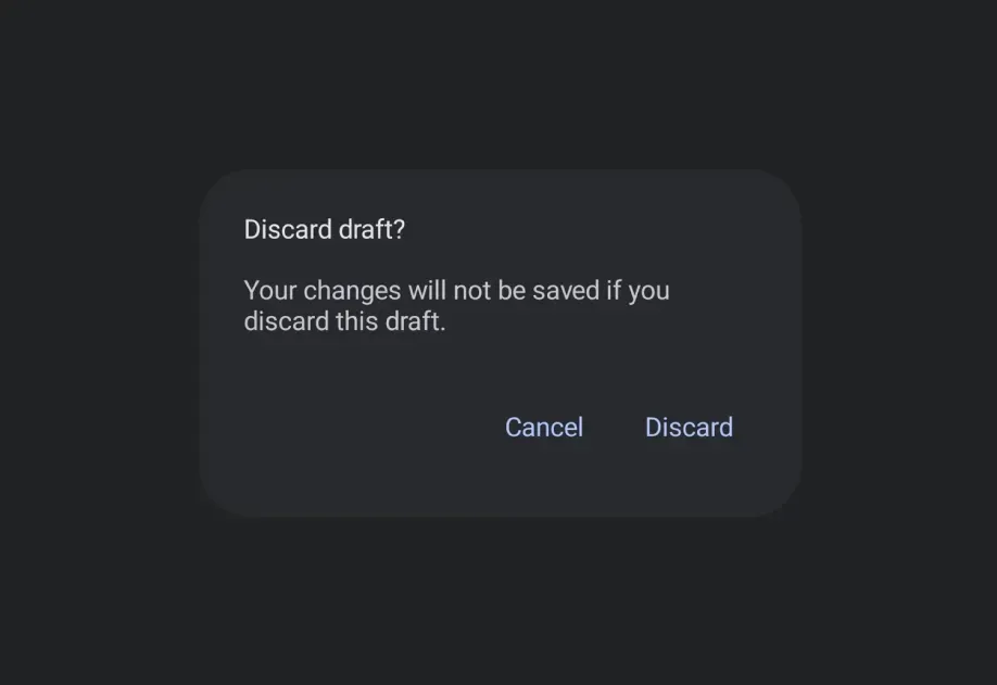




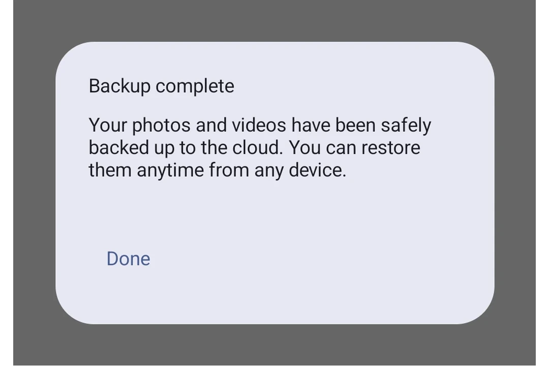
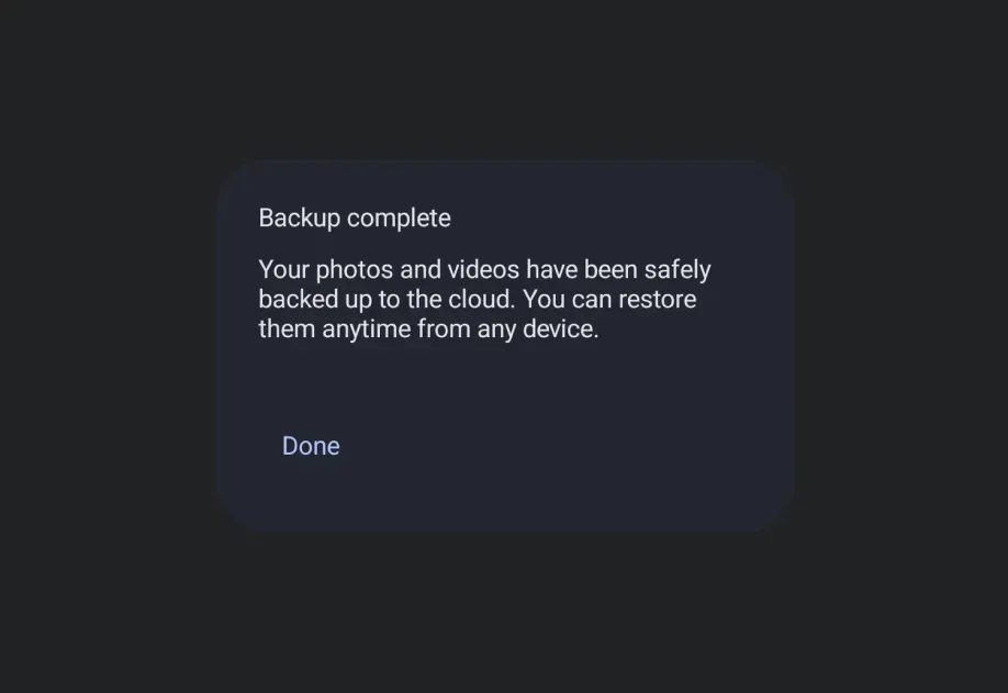





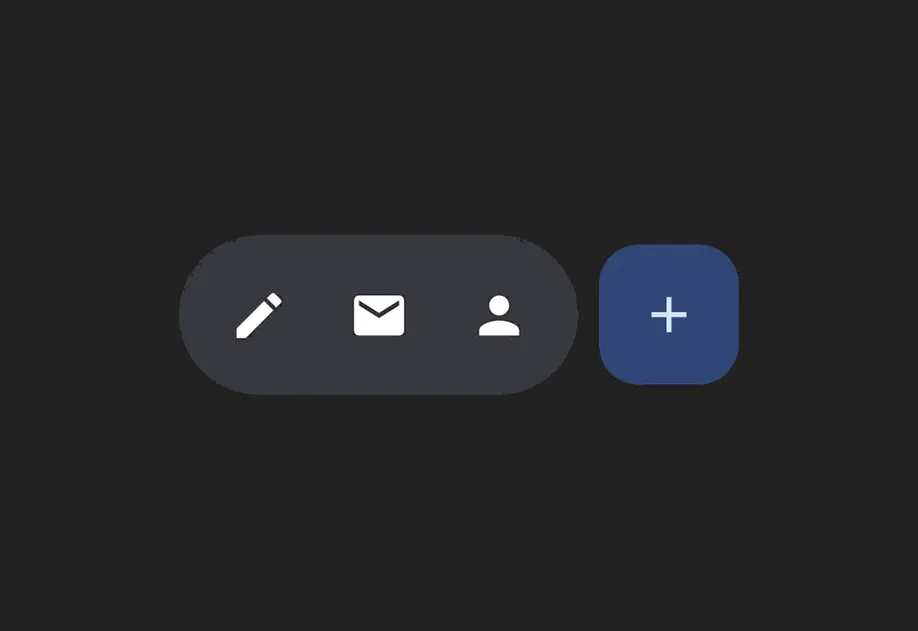
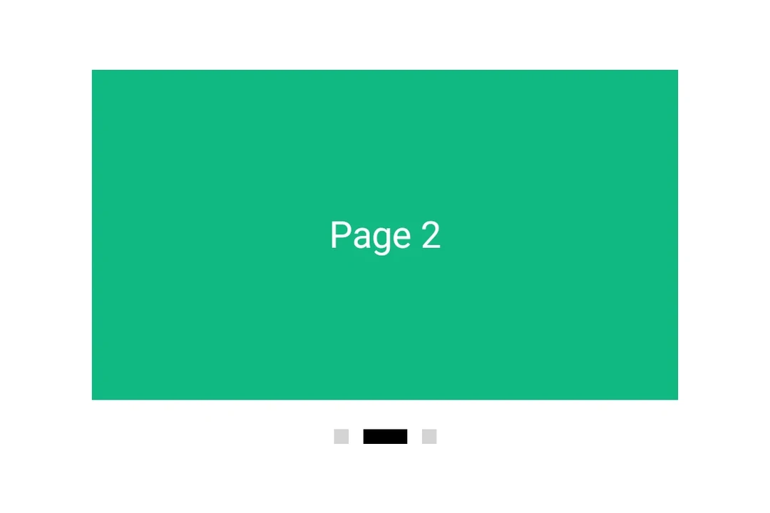
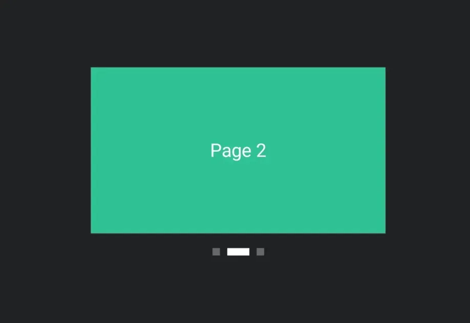
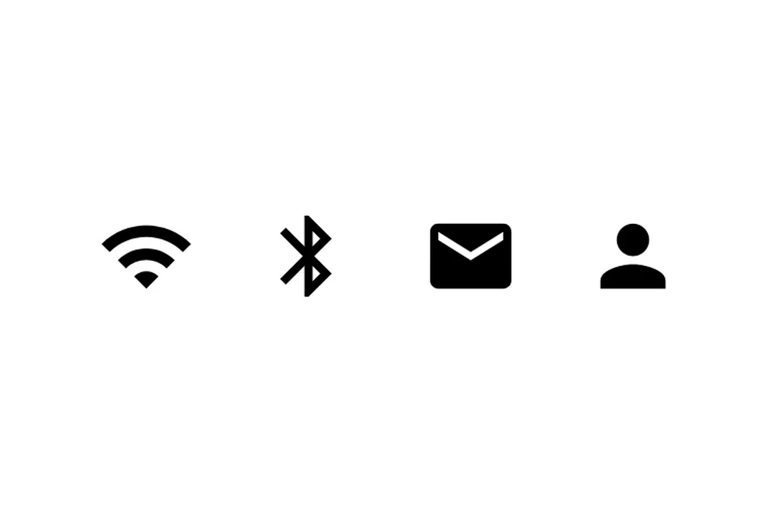





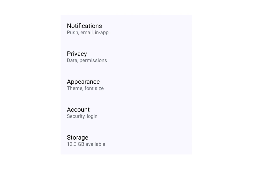
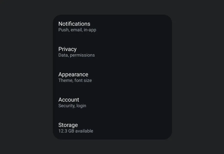










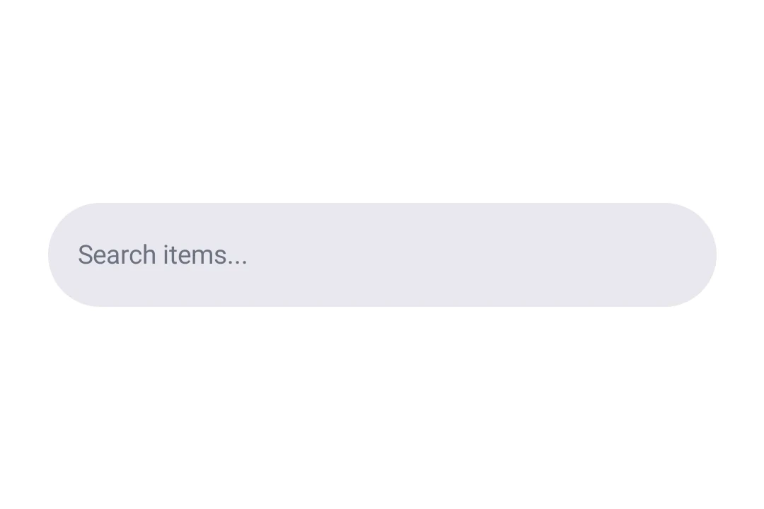
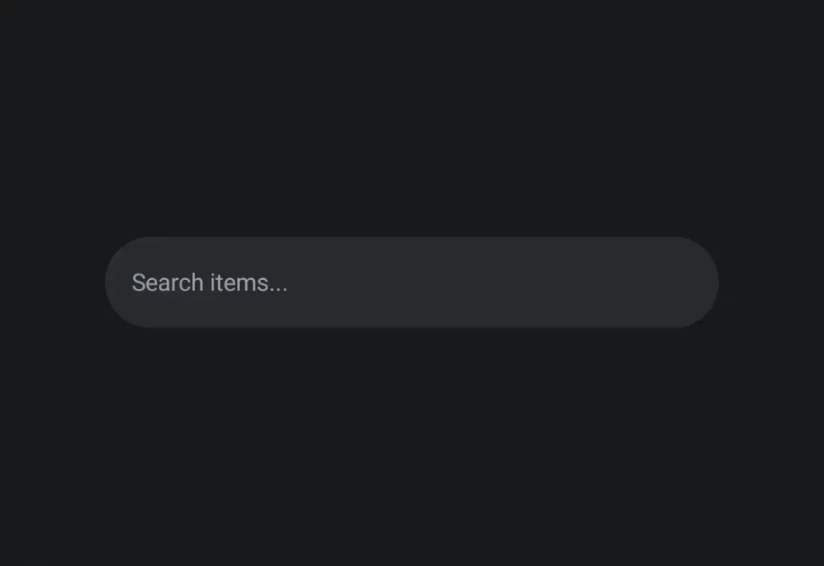
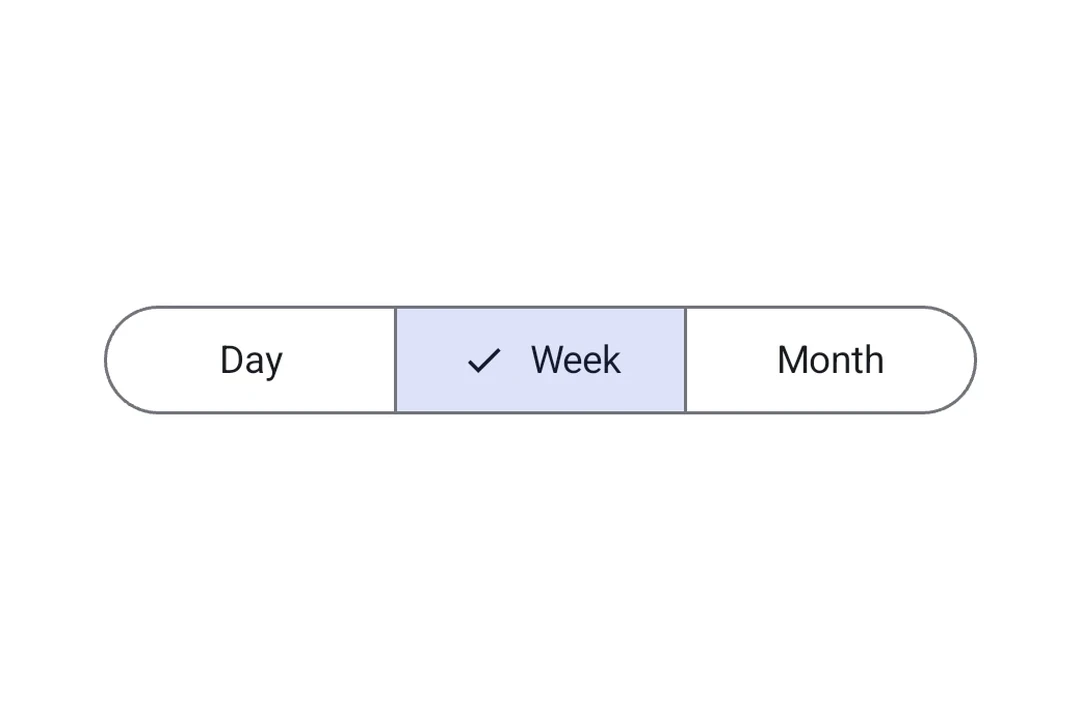
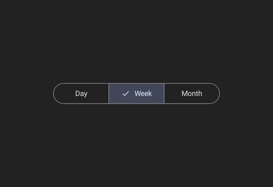




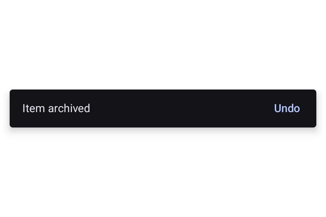
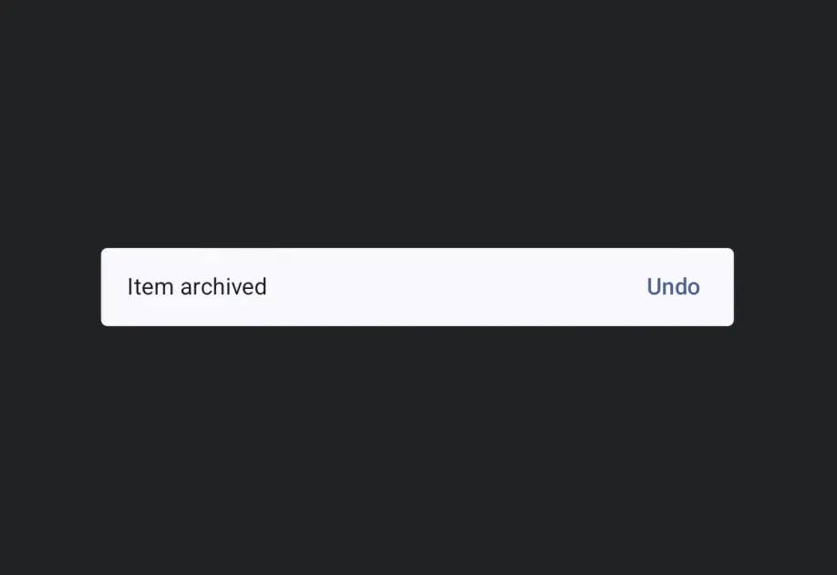
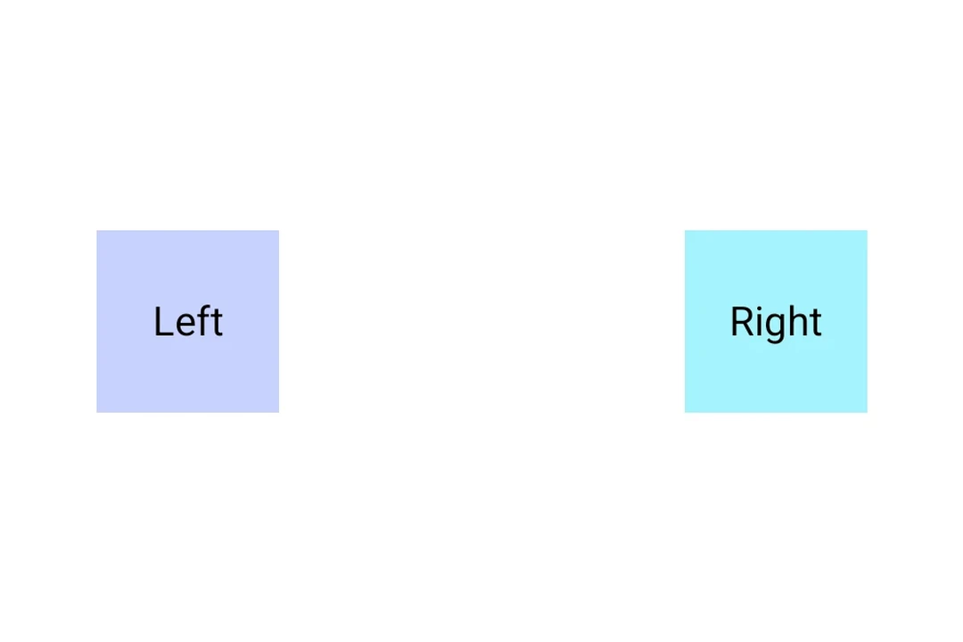
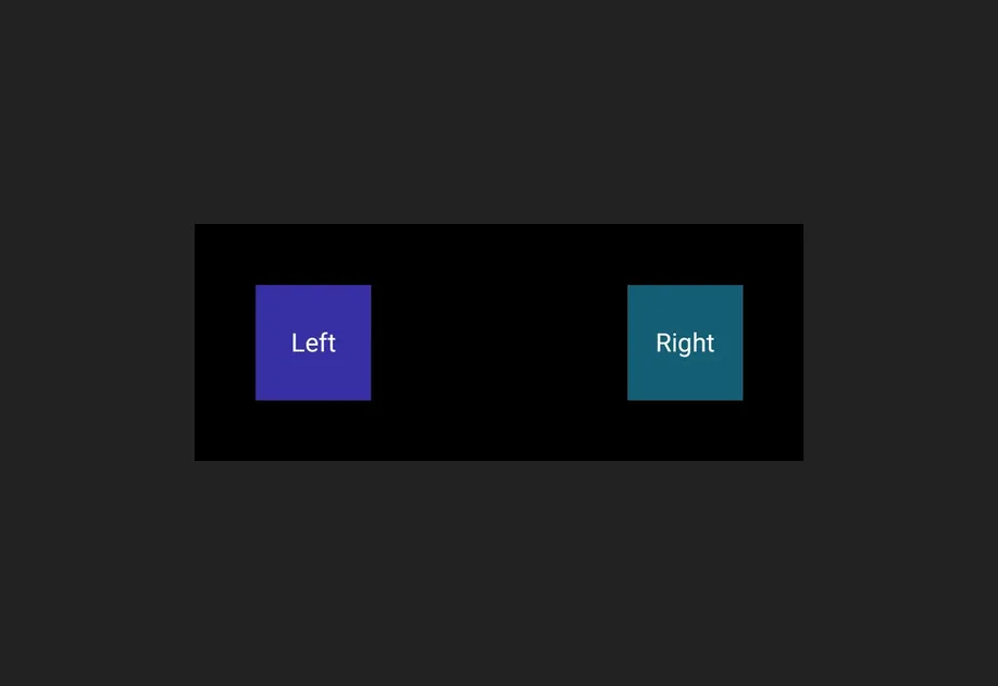


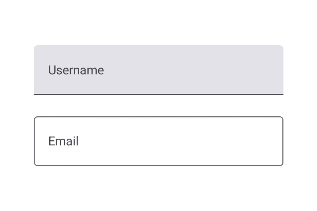
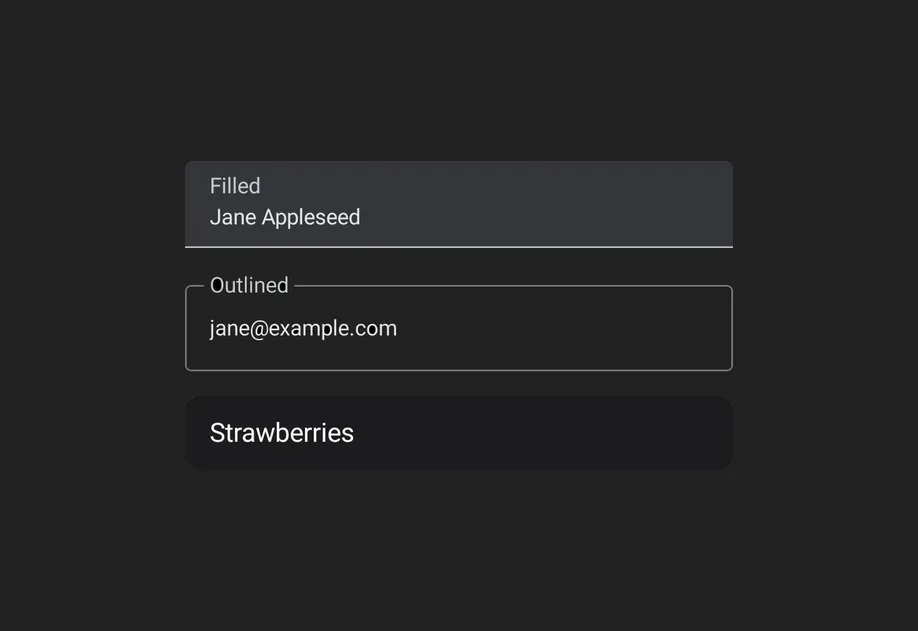
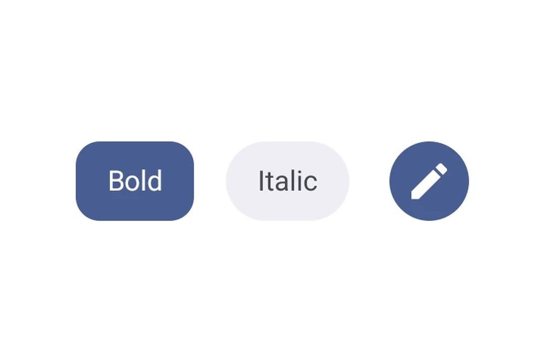
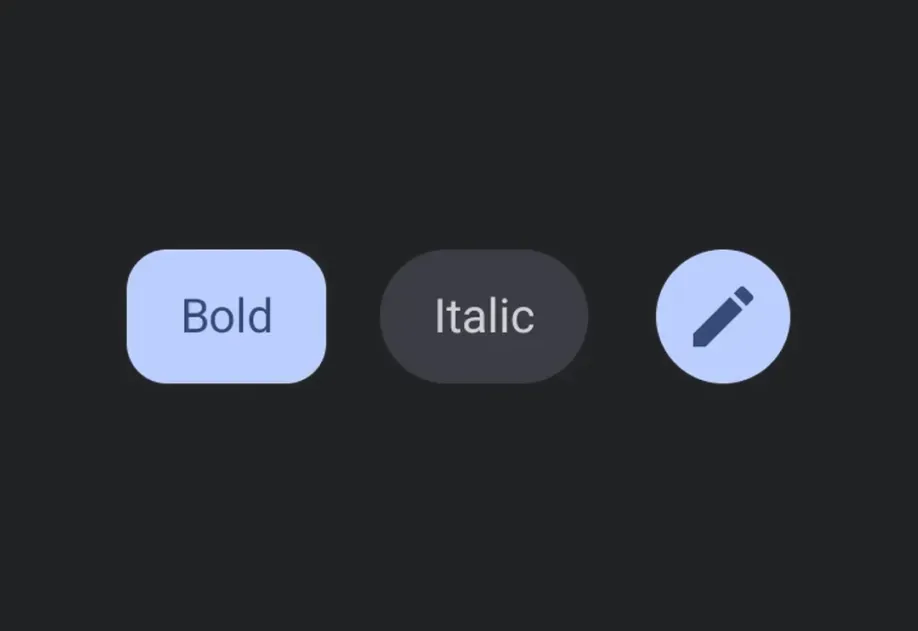

Examples
Modifiers
Modifiers are applied with the modifiers prop, in array order. Put background before paddingAll so the padding sits inside the background rather than outside it.
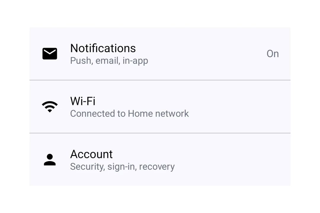
Settings screen
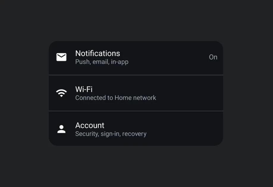
Combine ListItem slots with a Switch and an Icon to build a Material 3 settings screen.
Brightness row
A common pattern for brightness or volume controls is to flank a Slider with icons. Give the Slider a weight modifier so it takes the space left over by the icons.
Secondary text
Use ListItem.SupportingContent for the second line, and useMaterialColors for a text color that follows the light and dark themes.