Reference version

This documentation is available as Markdown for AI agents and LLMs. See the full Markdown index or append .md to any documentation URL.

List

A SwiftUI List component for displaying scrollable lists of items.

iOS
tvOS
Included in Expo Go
Recommended version:
~58.0.10

Expo UI List matches the official SwiftUI List API and supports styling via the listStyle modifier, various row/section modifiers, as well as selection, reordering, and editing capabilities.

A List with Favorites and Recents sections, each row showing a colored SF Symbol icon and a labelA List with Favorites and Recents sections, each row showing a colored SF Symbol icon and a label

Installation

Terminal
- npx expo install @expo/ui
- yarn expo install @expo/ui
- pnpm expo install @expo/ui
- bun expo install @expo/ui

If you are installing this in an existing React Native app, make sure to install expo in your project.

Usage

Basic list

BasicListExample.tsx
import { Host, List, Text, Section } from '@expo/ui/swift-ui'; export default function BasicListExample() { return ( <Host style={{ flex: 1 }}> <List> <Section title="Fruits"> <Text>Apple</Text> <Text>Banana</Text> <Text>Orange</Text> </Section> <Section title="Vegetables"> <Text>Carrot</Text> <Text>Broccoli</Text> <Text>Spinach</Text> </Section> </List> </Host> ); }

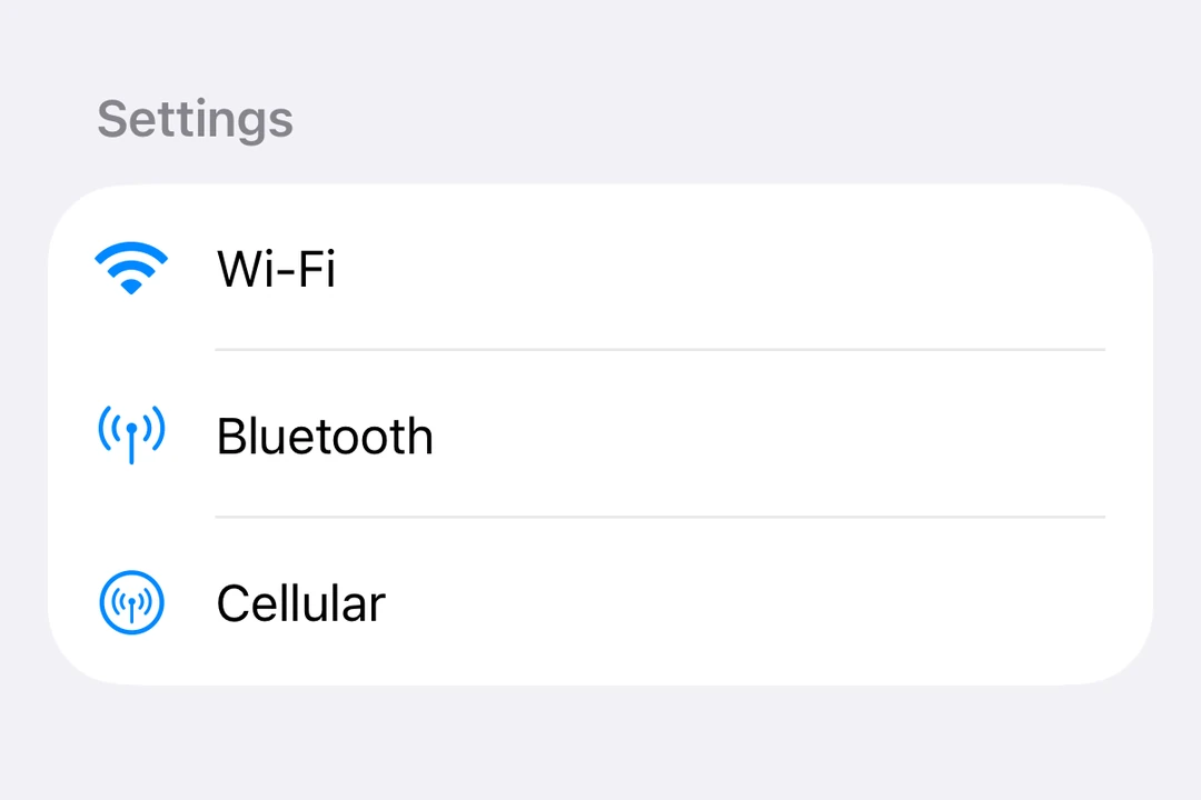
List with labels and icons

ListWithLabelsExample.tsx
import { Host, List, Label, Section } from '@expo/ui/swift-ui'; export default function ListWithLabelsExample() { return ( <Host style={{ flex: 1 }}> <List> <Section title="Settings"> <Label title="Wi-Fi" systemImage="wifi" /> <Label title="Bluetooth" systemImage="antenna.radiowaves.left.and.right" /> <Label title="Cellular" systemImage="antenna.radiowaves.left.and.right.circle" /> </Section> </List> </Host> ); }

Large lists

Use List.ForEach to render rows from an array. Pass the items as data, a unique key for each item with keyExtractor, and a children function that returns the row for an item. List.ForEach renders only the rows near the visible area and reuses them while you scroll.

LargeListExample.tsx
import { Host, List, Text } from '@expo/ui/swift-ui'; type Contact = { id: string; name: string }; const contacts: Contact[] = Array.from( { length: 10000 }, (_, i) => ({ id: String(i), name: `Contact ${i + 1}`, }) ); function renderContact({ item }: { item: Contact }) { return <Text>{item.name}</Text>; } export default function LargeListExample() { return ( <Host style={{ flex: 1 }}> <List> <List.ForEach data={contacts} keyExtractor={contact => contact.id}> {renderContact} </List.ForEach> </List> </Host> ); }

Follow these rules when you render rows:

  • Define the children function outside the component, or wrap it in useCallback. Otherwise, the rows near the visible area render again each time the component renders.
  • A reused row keeps the local state (useState) of the item it showed before. Reset the state when the item changes, or keep the state outside the row.
  • A row that is not ready yet shows an empty placeholder. Set estimatedItemSize close to the height of your row content, excluding the List insets, in points.
  • Use overscanCount to prepare more rows above and below the visible rows.
  • To update the rows, pass a new data array. Do not change the array in place.
  • Set recycling={false} to render every row up front.

List styles

Use the listStyle modifier to change the list's appearance.

ListStylesExample.tsx
import { useState } from 'react'; import { Host, List, Text, Section, Picker, } from '@expo/ui/swift-ui'; import { listStyle, pickerStyle, tag, } from '@expo/ui/swift-ui/modifiers'; const styles = [ 'automatic', 'plain', 'inset', 'insetGrouped', 'grouped', 'sidebar', ] as const; export default function ListStylesExample() { const [styleIndex, setStyleIndex] = useState(0); return ( <Host style={{ flex: 1 }}> <List modifiers={[listStyle(styles[styleIndex])]}> <Section title="Style Picker"> <Picker label="List Style" selection={styleIndex} onSelectionChange={setStyleIndex} modifiers={[pickerStyle('menu')]}> {styles.map((style, index) => ( <Text key={style} modifiers={[tag(index)]}> {style} </Text> ))} </Picker> </Section> <Section title="Sample Items"> <Text>Item 1</Text> <Text>Item 2</Text> <Text>Item 3</Text> </Section> </List> </Host> ); }

Selection and edit mode

Enable selection, deletion, and reordering of list items using the List.ForEach compound component with onDelete and onMove props.

  • Use the environment modifier to enable edit mode
  • Use the keyExtractor prop to identify items
  • Use the selection prop to control selected items
  • Use moveDisabled and deleteDisabled modifiers to disable these actions on individual items
EditableListExample.tsx
import { useState } from 'react'; import { Host, List, Label, Section, Button, Toggle, } from '@expo/ui/swift-ui'; import { environment } from '@expo/ui/swift-ui/modifiers'; type Task = { id: string; title: string }; const INITIAL_TASKS: Task[] = [ { id: '1', title: 'Task 1' }, { id: '2', title: 'Task 2' }, { id: '3', title: 'Task 3' }, { id: '4', title: 'Task 4' }, ]; function renderTask({ item }: { item: Task }) { return <Label title={item.title} />; } export default function EditableListExample() { const [tasks, setTasks] = useState<Task[]>(INITIAL_TASKS); const [selectedIds, setSelectedIds] = useState<string[]>([]); const [editMode, setEditMode] = useState(false); const handleDelete = (indices: number[]) => { setTasks(prev => prev.filter((_, i) => !indices.includes(i))); }; const handleMove = ( sourceIndices: number[], destination: number ) => { setTasks(prev => { const newTasks = [...prev]; const [removed] = newTasks.splice(sourceIndices[0], 1); const adjustedDest = sourceIndices[0] < destination ? destination - 1 : destination; newTasks.splice(adjustedDest, 0, removed); return newTasks; }); }; return ( <Host style={{ flex: 1 }}> <List selection={selectedIds} onSelectionChange={ids => setSelectedIds(ids.map(String))} modifiers={[ environment('editMode', editMode ? 'active' : 'inactive'), ]}> <Section title="Settings"> <Toggle label="Edit mode" isOn={editMode} onIsOnChange={setEditMode} /> </Section> <Section title="Tasks"> <List.ForEach data={tasks} keyExtractor={task => task.id} onDelete={handleDelete} onMove={handleMove}> {renderTask} </List.ForEach> </Section> </List> </Host> ); }

Pull to refresh

Use the refreshable modifier to enable pull-to-refresh functionality.

RefreshableListExample.tsx
import { useState } from 'react'; import { Host, List, Text, Section } from '@expo/ui/swift-ui'; import { refreshable } from '@expo/ui/swift-ui/modifiers'; export default function RefreshableListExample() { const [lastRefresh, setLastRefresh] = useState<Date | null>(null); const handleRefresh = async () => { // Simulate async data fetching await new Promise(resolve => setTimeout(resolve, 1500)); setLastRefresh(new Date()); }; return ( <Host style={{ flex: 1 }}> <List modifiers={[refreshable(handleRefresh)]}> <Section title="Data"> <Text>Pull down to refresh</Text> {lastRefresh && ( <Text> Last refresh: {lastRefresh.toLocaleTimeString()} </Text> )} </Section> </List> </Host> ); }

Row styling

Use listRowBackground, listRowSeparator, listRowSeparatorTint, and listRowInsets modifiers to customize individual rows. Use alignmentGuide with the listRowSeparatorLeading guide to set where a row separator starts.

RowStylingExample.tsx
import { Host, List, Text, Section } from '@expo/ui/swift-ui'; import { alignmentGuide, listRowBackground, listRowSeparator, listRowSeparatorTint, listRowInsets, } from '@expo/ui/swift-ui/modifiers'; export default function RowStylingExample() { return ( <Host style={{ flex: 1 }}> <List> <Section title="Styled Rows"> <Text modifiers={[listRowBackground('blue')]}> Blue background </Text> <Text modifiers={[listRowSeparator('hidden')]}> Hidden separator </Text> <Text modifiers={[listRowSeparatorTint('red')]}> Red separator </Text> <Text modifiers={[listRowInsets({ leading: 40 })]}> Extra leading inset </Text> <Text modifiers={[ listRowInsets({ leading: 0, trailing: 0 }), ]}> No horizontal insets </Text> <Text modifiers={[ alignmentGuide('listRowSeparatorLeading', 32), ]}> Separator starts 32 points in </Text> </Section> </List> </Host> ); }

Keyboard dismiss behavior

Use the scrollDismissesKeyboard modifier to control how the keyboard is dismissed when scrolling.

KeyboardDismissExample.tsx
import { Host, List, Section, TextField } from '@expo/ui/swift-ui'; import { scrollDismissesKeyboard } from '@expo/ui/swift-ui/modifiers'; export default function KeyboardDismissExample() { return ( <Host style={{ flex: 1 }}> <List modifiers={[scrollDismissesKeyboard('interactively')]}> <Section title="Form"> <TextField placeholder="Name" /> <TextField placeholder="Email" /> <TextField placeholder="Phone" /> </Section> </List> </Host> ); }

Header prominence

Use the headerProminence modifier to adjust the visual prominence of section headers.

HeaderProminenceExample.tsx
import { Host, List, Text, Section } from '@expo/ui/swift-ui'; import { headerProminence } from '@expo/ui/swift-ui/modifiers'; export default function HeaderProminenceExample() { return ( <Host style={{ flex: 1 }}> <List modifiers={[headerProminence('increased')]}> <Section title="Important Section"> <Text>This section has increased header prominence</Text> </Section> <Section title="Another Section"> <Text>Headers are more prominent</Text> </Section> </List> </Host> ); }

API

import { List } from '@expo/ui/swift-ui';

Components

List

iOS
tvOS

Type: React.Element<ListProps>

A list component that renders its children using a native SwiftUI List.

ListProps

children

iOS
tvOS
Type: ReactNode

The children elements to be rendered inside the list.

onSelectionChange

iOS
tvOS
Optional • Type: (selection: (string | number)[]) => void

Callback triggered when the selection changes in a list. Returns an array of selected item tags.

selection

iOS
tvOS
Optional • Type: (string | number)[]

The currently selected item tags.

ListForEach

iOS
tvOS

Type: React.Element<ListForEachProps<T>>

A group of rows inside List, with optional deletion and reordering. Pass data with keyExtractor, and render each row from a children function. Recycles rows unless recycling is false.

ListForEachProps

children

iOS
tvOS
Type: (info: { index: number, item: T }) => ReactElement

Renders a row. When recycling is true, wrap it in useCallback, or every row re-renders on each parent render. Recycled rows are reused for other items, so their local state (useState) carries over. Reset it when the item changes, or keep the state outside the row.

data

iOS
tvOS
Type: readonly T[]

Items to display. Replace the array when updating data.

estimatedItemSize

iOS
tvOS
Optional • Type: number • Default: 64

Placeholder height in points, excluding List insets, until a row is measured. Must be positive. Ignored when recycling is false.

keyExtractor

iOS
tvOS
Type: (item: T, index: number) => string

Returns a stable, unique string key, also used for List selection.

onDelete

iOS
tvOS
Optional • Type: (indices: number[]) => void

Called with deleted indices from this group's data array.

onMove

iOS
tvOS
Optional • Type: (sourceIndices: number[], destination: number) => void

Called with the source indices and the destination index. The destination index counts positions before the moved items are removed, so it can equal data.length.

overscanCount

iOS
tvOS
Optional • Type: number • Default: 10

Extra rows to prepare on each side of the visible rows. Must be a non-negative integer. Ignored when recycling is false.

recycling

iOS
tvOS
Optional • Type: boolean • Default: true

Renders only the rows near the visible range and reuses them while scrolling. Set to false to render every row at once. Set it once; changing it remounts the rows.