This is documentation for the next SDK version. For up-to-date documentation, see the latest version (SDK 56).
NavigationBar
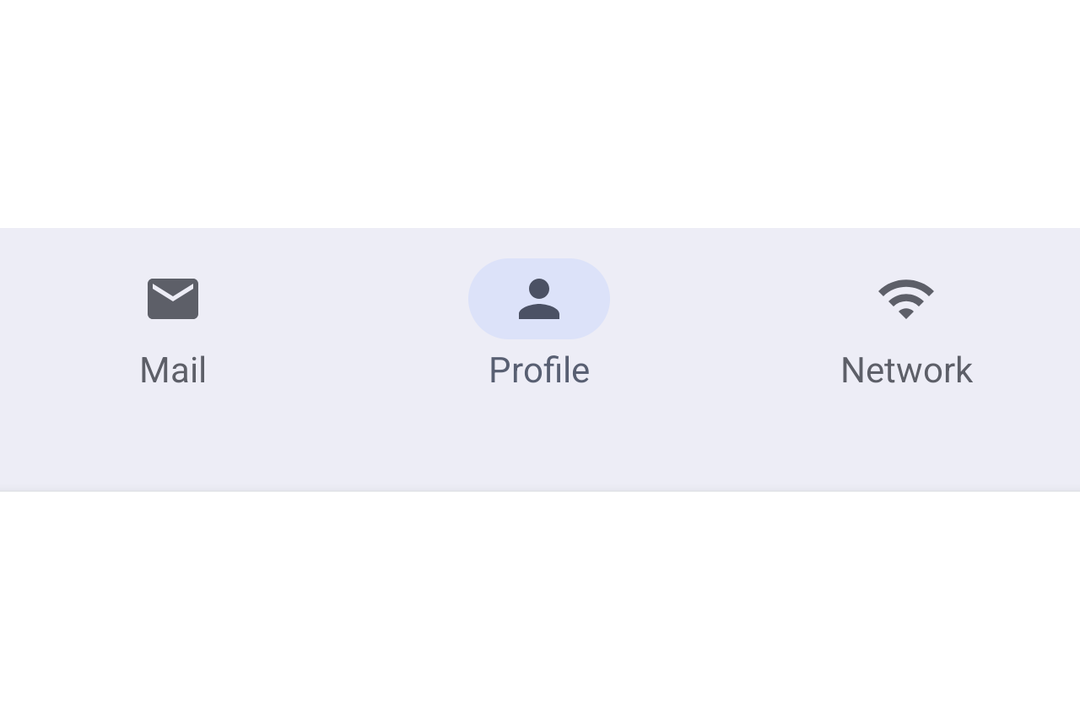
A Jetpack Compose NavigationBar component for Material 3 bottom navigation.
For the complete documentation index, see llms.txt. Use this file to discover all available pages.
Expo UI NavigationBar matches the official Jetpack Compose NavigationBar API. It displays a row of destinations for switching between top-level app sections.
Installation
- npx expo install @expo/uiIf you are installing this in an existing React Native app, make sure to install expo in your project.
Usage
Basic navigation bar
Manage the selected item in React state and pass selected to each NavigationBarItem.
import { useState } from 'react';
import { Host, Icon, NavigationBar, NavigationBarItem, Text } from '@expo/ui/jetpack-compose';

const HOME_ICON = require('./assets/home.xml');
const SEARCH_ICON = require('./assets/search.xml');
const SETTINGS_ICON = require('./assets/settings.xml');

export default function BasicNavigationBar() {
  const [selectedTab, setSelectedTab] = useState('home');

  return (
    <Host matchContents>
      <NavigationBar>
        <NavigationBarItem selected={selectedTab === 'home'} onClick={() => setSelectedTab('home')}>
          <NavigationBarItem.Icon>
            <Icon source={HOME_ICON} />
          </NavigationBarItem.Icon>
          <NavigationBarItem.Label>
            <Text>Home</Text>
          </NavigationBarItem.Label>
        </NavigationBarItem>

        <NavigationBarItem
          selected={selectedTab === 'search'}
          onClick={() => setSelectedTab('search')}>
          <NavigationBarItem.Icon>
            <Icon source={SEARCH_ICON} />
          </NavigationBarItem.Icon>
          <NavigationBarItem.Label>
            <Text>Search</Text>
          </NavigationBarItem.Label>
        </NavigationBarItem>

        <NavigationBarItem
          selected={selectedTab === 'settings'}
          onClick={() => setSelectedTab('settings')}>
          <NavigationBarItem.Icon>
            <Icon source={SETTINGS_ICON} />
          </NavigationBarItem.Icon>
          <NavigationBarItem.Label>
            <Text>Settings</Text>
          </NavigationBarItem.Label>
        </NavigationBarItem>
      </NavigationBar>
    </Host>
  );
}
API
import { NavigationBar, NavigationBarItem } from '@expo/ui/jetpack-compose';
Components
Type: React.Element<NavigationBarProps>
A Material Design 3 navigation bar.
ColorValue • Default: NavigationBarDefaults.containerColorBackground color of the navigation bar.
ColorValue • Default: contentColorFor(containerColor)Preferred content color inside the navigation bar.
Type: React.Element<NavigationBarItemProps>
A Material Design 3 navigation bar item. Must be used inside NavigationBar.
React.ReactNodeChildren containing Icon, SelectedIcon, and Label slots.
Types
Colors for navigation bar items in different states.
| Property | Type | Description |
|---|---|---|
| disabledIconColor(optional) | ColorValue | - |
| disabledTextColor(optional) | ColorValue | - |
| selectedIconColor(optional) | ColorValue | - |
| selectedIndicatorColor(optional) | ColorValue | - |
| selectedTextColor(optional) | ColorValue | - |
| unselectedIconColor(optional) | ColorValue | - |
| unselectedTextColor(optional) | ColorValue | - |